Fonts and typefaces
What are the connotations of the following fonts:


Comic sans: For a younger audience, cartoon, fun, colourful. This font has softer edges and bolder letters making it easier to read and more informal.
Times new roman: More sophisticated, harder edges to the font, sharper, cleaner and more formal. This is likely to be used when trying to be more professional, historical and ancient connotations.
"font" and "typeface" are two terms that are often incorrectly used interchangeably.
A font is one particular weight and style of a larger typeface.
Typefaces are categories comprised of many different fonts. For example, serif is a type face, and times new roman is a font that is part of the serif family. There are a variety of different typefaces and fonts.
Serif: identifiable by the small lines on the edges of letters (called serifs) that make the font easier to read in print. Fonts in the Serif typeface include Times new roman, Georgia, and Book Antiqua.
San serif: sans serif font letters don't have a serif attached to them, so they display more clearly on websites. Fonts in the sans serif typeface include arial, Verdana, and Helvetica. 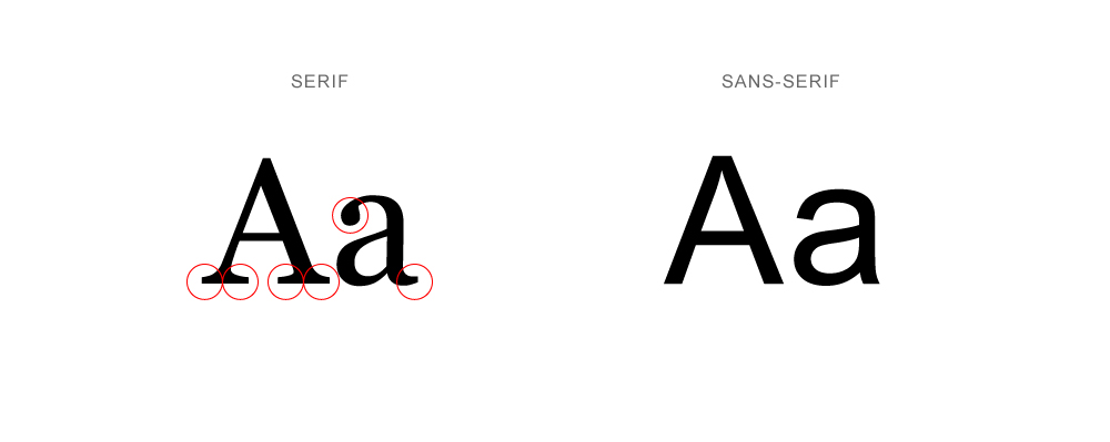
Script: fonts in the script typeface are meant to imitate the fluidity of human handwriting. Fonts in the script typeface include comic sans, Kristen, and Lucida.
Modern or display: the modern typeface is characterised by variance between thick and thin lines in the lettering. Fonts in the modern typeface include Impact, Rockwell, and Agency.
Monospaced: They have larger spaces between each letter and were designed to look like text was written using a typewriter. Fonts in the monospaced typeface include Courier, Consolas, and Monaco.
Serif fonts were rated as "stable", "practical", and "mature"
Sans serif fonts didn't receive any particular positive or negative personality associations.
Script fonts were perceived as feminine, funny and casual.
Modern fonts were categorised as masculine, assertive and coarse.
Monospaced fonts were called dull, plain and unimaginative.
The masthead: Serif, gives a chic and professional look. It is easy to read for print and therefore is able to easily attract attention from customers passing by.
Cover line: Script, perceived as more feminine and casual to entice the target audience which is typically women.
Other cover line: modern, easy to read on print and more assertive to allow the magazine to get the point across.
Headline: modern, bold font with soft edges and is easy to read for a younger audience who might only be starting to learn how to read. The font is large and prominent on the page to make it clear.
Subtitles and main text: sans serif, appealing to kids due to the fun connotations which come with it.
Photo text: script, imitating handwriting with a more feminine feel to it in order to relate to the target audience of young girls.
Comments
Post a Comment